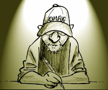
 This is pretty typical page that I inked over Mr. B.
I found that keeping things simple worked better than burying his art under a bunch of rendering and left room for color.
I used blacks in the foreground to create depth.
Note how well he laid out his pages.
4 comments:
Those solid blacks look good!
Great inking. It reminds me of the older FFs when Dick Ayers was inking. Not a whole lot of details, but looks nice with great silhouettes. Only you don't make things as stiff as Dick Ayers did. John Buscema was an incredible artist. He makes eveything look so solid. Great post.
Thanks Shawn.
Thanks Weirdo.
I think the reason my inks look so fluid is that I only used a brush during this period.
I used to think John Buscema was in a class by himself, but now I realize there were two artists breathing and working in that rarified air. Beautiful drawings like this you rarely (if ever) see these days. All I can say is "Woooowwwww!" Classic Illustration doesn't get much better than this!
Post a Comment